Project Info
Semester: Spring 2023 | Professor: Hye-Jin Nae | Project 1: Digital Driver's License
Timeframe: 6 weeks | Program(s) used: Figma, Adobe Premire | Project Status: Complete
See the finished project below, read further to see my process!
Prompt
Modern times call for modern solutions- the sooner we take the time to upgrade things used in everyday life, the more convenient our lives will become. In this case I am citing specifically the concept of physical licenses. How many people keep their licenses, cards, gift cards, IDs, etc... in their purse/wallet? How often are you caught up focusing on something important and forget or misplace your wallet or purse? Now, how often do you forget your phone? For many the answer is not often.
It is for this exact reason why I have a wallet case for my phone, but this isn’t a practical solution for everyone. A wallet case may be functionally convenient, but it is also large, awkward, and does not fit comfortably in most pockets. However, what is both physically and functionally convenient is a Digital License.
A well-designed digital license is not only easy to use, it creates opportunity for delight, is aesthetically pleasing, and in this case brings pride for one’s home state.
Process
When critiquing a physical license what is the first feature that comes to mind? For me it is the sheer amount of information displayed on a tiny, pocket-sized piece of plastic. To critique this feature, simply put it is too cluttered and is not aesthetically pleasing. As a designer I see this as an opprotunity. Every resident of the US carries some sort of an ID, whether it be a driver's license, state license, working ID, etc... . A driver's license and/or state license is perhaps one of the most societally important objects we will ever own, and as such should have much more visually pleasing design. Good design is not only functional, it can also bring delight to the user, which can lead to pride and loyalty towards the focus of design (take Canadian money, for example. An average object, yet even Americans are enthralled with their glow in the dark quarters and sweet maple-syrup smelling bills.).
Seeing as my biggest problem with physical licenses is clutter, my main foci became spacing and display of information, with a secondary focus on creating delight. To do this I started with simple wireframing designs focused on navigation and basic visuals.
For visual design I was heavily inspired by two major themes in New York State; the sleek, bold, iconic, and slightly edgy vibe of NY City, and the more laid back naturesque themes from pretty much everywhere north of the city, speicifically Upstate NY. The first inspiration board reflects the bold, vibrant, and edgy theme of NYC. I wanted to play with the theme of the City being known as "the Big Apple", hence the very warm red color scheme of the center image, carried over into my initial designs. Structurally, I enjoyed the texture from the left image separating the image from body text as well as the overall simple layout, and for the far the minor geometric accents seemed to hold a lot of potential. As for the center right and left imagery, similar to the far left, I enjoyed the layout and use of space, and for the right I had wanted to play with large design-y typography in a Vogue-esce manner.
The second inspiration board is the exact opposite of this. Inspired by everywhere else in NY State beyond NYC (specifically Upstate NY), I decided to go with a more calm, nature-inspired design. My design ended leaning heavily on the large image to the right for color scheme and theme, which was then supplimented by the design layouts of the other three images. I had wanted the design to be visually recognizable to ensure easy use, yet aestehtically pleasing to the user. For this reason I wanted to incorporate curves/organic shapes and large imagery alogside the text.
Wireframing & Iterations
Here are my initial low-fi experimental wireframes for the process. The first 3 were heavily based off of my first inspiration board. I had wanted to continue playing with the idea of bold text as a design element, similar to vogue.

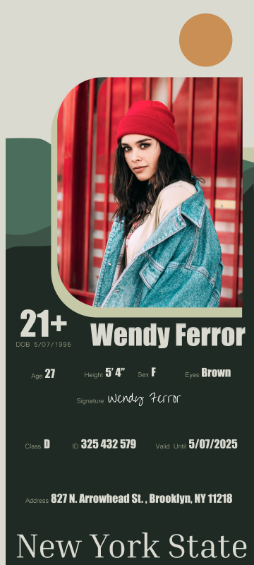
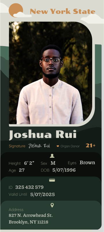
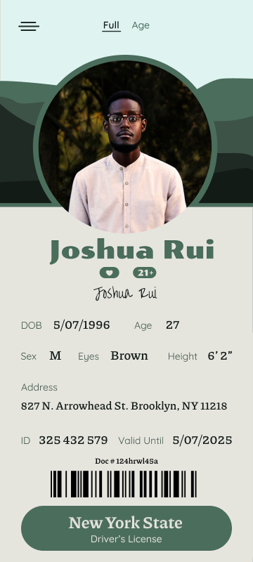

Initially for this project I had wanted to go BOLD and grungy. Think Big Apple NYC. However, after further consideration I decided against it. I wanted to create an app that represented all of NY State, not just the city. And so, I turned to what I love most about NY State; our forests. Through iterations my design landed on the image at the far right. Ultimately, this design felt the best when handled and was much more aesthetically pleasing.
