Spring 2023 | Elements III | Playing Cards App
Programs Used
program, length of experience, programs used in the project
Figma - 1yr; App creation and prototyping
Adobe Illustrator - 5yrs; Card Illustration
Spring 2022 was a Figma bootcamp for my fellow classmates and I, and it sure felt like it. Prior to this class none of us had much exposure to Figma nor app or web design, but that didn't stop our amazing Prof. Mike Minerva from assigning us two half semester Figma projects. The premise was simple; design and illustrate a deck of cards, then design and prototype an app for said cards. It is because of Prof. Mike and this project that I grew significantly as a designer and am quite satisfied with the project final outcome.
Process
We were first tasked with overall design of the cards, then to prototype a few simple app UIs that simulate a hand of cards. For my design rather than simply redesign the colors I wanted to design special characters for the King, Queen, and Jack. Inspired by my love for nature and the wildlife of NY State I settled on a forest critter theme, with a stag replacing the King, a doe for the Queen, and a fox for the Jack.
Prototyping the app


Failed Prototype
Using the mini prototypes we were assigned the following; create an add/delete feature, then a filter & sort menu, a profile menu, and a settings menu. For my first major prototype I chose one of the minis and prototyped an add feature for that. However, after partially prototyping I realized the interface was not ideally designed with the other menu options in mind, so that prototype was scratched.
Final Project
Final Prototype
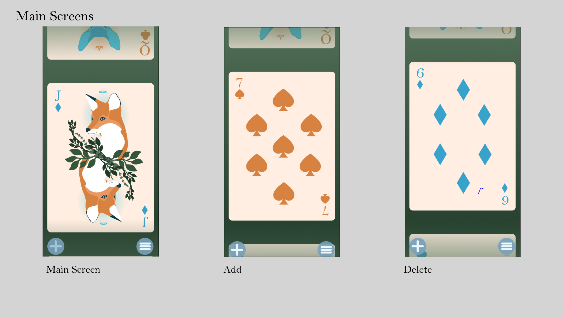
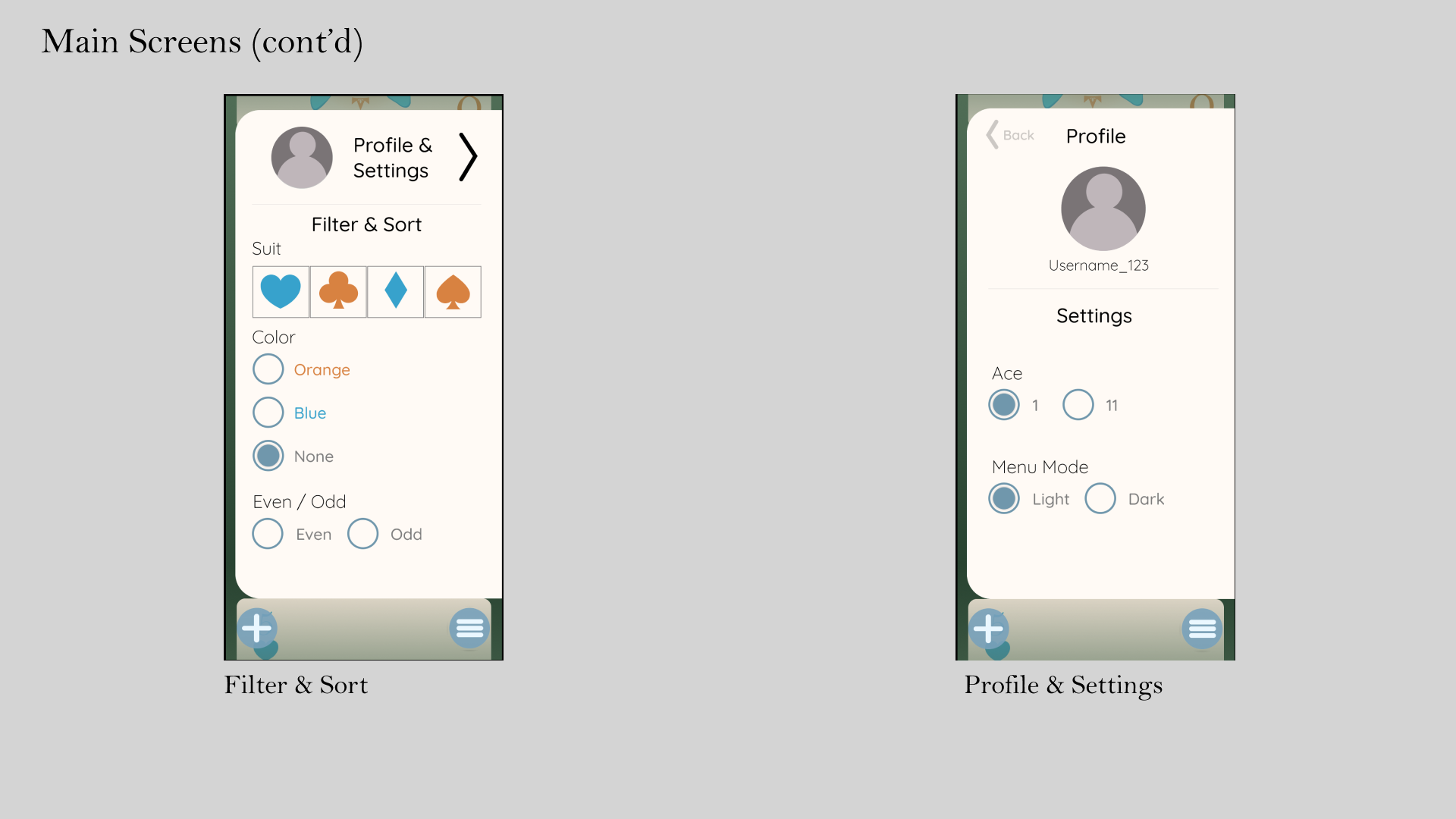
My second prototype was much more successful. Rather than showing the cards as they would appear in someone's hand, I created a scroll feature to let the user easily flip through their cards. The interface is also much more user friendly, with slightly smaller buttons taking up less of the screen. To navigate, simply scroll up or down through the cards, swipe right on a card to delete it, press the "+" button at the bottom left to add a card back, and press the menu button at the bottom right to filter and sort through several different options, as well as access the app's settings and user profile.
Final Thoughts
I am quite happy with this outcome, which is not something I often find myself saying. During this project I sustained a mild concussion due to being rear ended in a car accident, resulting in my inability to look at a screen for about a month and decreased my time to work on this project by at least half. On top of that this project was also my first real attempt at anything web or mobile related. I am extremely happy with the design of the cards themselves and have already had several inquiries about getting it printed into a physical deck! The app design I am slightly less happy with but still satisfied. The overall design was successful, but if I could change one thing about my final it would be to include a feature where the user can physically see all their cards at once rather than needing to scroll through them, similar to the second screenshot before the failed prototype. The menu and scroll features both work well, but as a user I would find it inconvenient if I needed to scroll through my cards every time I want to see my entire hand. This is a feature I had intended to add, but, due to my unexpectedly shortened timeframe, was unable to do so.


